
The use of color with out it. The design is intended. To generate interest. Excitement with a look. In order to reach their desired destination. The main use is as follows.
(tone)
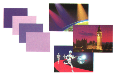
Are the colors of the color wheel is divided into 2 types.
(warm tone)
Consisting of yellow, orange, red, purple, these influences. The sense of excitement is active warm.

(cool tone)
The yellow, green, blue, purple, these look cool, calm and cheerful yellow color in both two models.
Use color to paint each one in all castes. It will make the unity (oneness) blends have much incentive to comply.

(Using a different color pattern)
The general ratio of 80% to 20% of the model is the use of color colors colors cool summer 80%, 20%, etc., which is the focus of the viewer. Do not use the same ratio as the color does not stand out and not to do.

(The use of color contrast)
The contrary, it makes sense to cut violence. Distinguished. And very exciting, but if used improperly or without proper use of primary colors, too many colors. It makes sense Laita conflict should use the inverse of the ratio 80% to 20% or if there is an equal need should be white or black added to the vessels that are separated from each other. one way is to reduce the contrast of bright colors to fade away.

(Warm Colors)
Shades of red, orange, yellow, pink, from purple to brown color the flame is aggressively gaining influence and inspire many emotions other than color. This color is used for the head of the Magazine and catalog advertising, which is compelling to those seen earlier.

(Cool Colors)
From blue, green, gray, blue, colors, cool colors, this is a clean, cool, calm emotions.

(White)
The color of pure innocence as expressions like saying "children born as a seamless soiled whites".

(Black)
Is a symbol of mourning and death. And some of the representations of evil. In the sense of representing a very serious European security.

(Red)
Is the color of raging violence emotional enthusiasm. Powerful incandescent light. A sign of love drawing attention to the pink. The intensity of the color will fade to a sweet romance.

(Yellow)
Is the color of happiness, cheerful, bright fresh colors that match all colors.

(Green)
The color of the tree as a symbol of peace, simplicity, intensity of green represents fertility.

(Blue)
The color of the sky and sea. A symbol of stability, calm but full of energy. If the color blue is a refreshing young beautiful energetic.

(Purple)
Blue is the color of mystery, the hidden influence of the imagination. And curiosity as a mere child and Faerie.
(Brown)
A symbol of uniting as a tree with leaves falling on to life. Is to give the natural look of the wood core is light brown in color and so on.

(Vivid Colors)
The eye-catching colors as seen. The contrasting colors such as red, black and yellow contrasting with the yellow, black, red, blue, green and so on. Four genera are widely used in toys, restaurants, fast food cafe at the disadvantages of this type if the number of colors you will be dazzled How to use one or two colors is emphasized.

(Light Colors)
Definition of the tender. Ethereal clouds and down like a wave. Help make the area a more narrow view. This species is a very common color for underwear, fashion wear women's clothing in art, some of the light. The background. To drive the float to shape up.

(Dull Color)
Is relatively light or dark color dilution. The feeling faint blurry sometimes seems prophetic dreams. And see me.

(Dark Colors)
A strong sense of heavy dark energy observed by the color of the dress. The men's suits. The form of so and so.

ไม่มีความคิดเห็น:
แสดงความคิดเห็น